Showing posts with label Fedrigoni. Show all posts
Showing posts with label Fedrigoni. Show all posts
Thursday, 24 May 2012
Wednesday, 2 May 2012
Name Cards.
For our event 132 5 by issey miyake i thought another way to promote the paper would be to create name cards for the audience, this way i create another item for them to take away which means another piece of fedrigoni paper, the range is coming together quite nicely now just need to finalise some more designs and we should be finished.


Bookmarks.
Needing to add some more things to our product range i feel book marks would be a great addition, something the audience could take away and make use of, helping sustain the promotion of the event and paper, i also want to use see through bags to give away the gifts, this way you would be able to see the paper through the bags making them more appealing.


Wrapping.
As we need to make use of as much paper as possible in order to showcase and promote it, i felt using a single sheet of white A4 paper to rap the invitations in would be perfect, earlier on my blog i have shown how the folds would work for this, here are a few more minimal designs i created, these designs are kept fairly minimal and do not need to hold any information as the invitation itself does that for me.


Minimal.
Starting to design with a much more minimal approach, this is definitely how i work best, i struggle to keep things simple as soon as i begin, these are my favourite posters so far, especially looking from a fashion perspective, the fashion industry is renowned for it's innovative minimal and conceptual graphic design, something i need to consider throughout my development.
I'm really happy with the set of icons i developed for this brief i think they fit in perfectly with both fashion and paper and give a great aesthetic.


I'm really happy with the set of icons i developed for this brief i think they fit in perfectly with both fashion and paper and give a great aesthetic.


4 Dimensions.
Whilst thinking of ways to expand on our deliverables for this project, it occured to me that i still havnt considered 4 dimensional posters, ones that change through distance or time, with the project theme being paper, i thought a poster unfolding itself through a series of posters would be a great idea, this is still unfinished but i think the idea has great potential, the finished posters would more than likely reveal information of the event through 3 or more posters.


Sunday, 29 April 2012
Patterns.
Using the previously created patterns to vary the design direction, due to all the designs being extremely geometrical, the pattern of the icons creates and re-creates more patterns within, i'm starting to like these designs i feel they could work better as packaging for the invitations as apposed to promotional posters for the event, this has worked out better really giving me more options .


Posters 3.
Again another variation of posters, i'm thinking the simpler the better at the beginning of designs i always create busy composition and need to just start of basic and build up from that.
These design using again the icons created with a European style the black lines representing pieces of stacked paper, still not happy but it's giving me chance toe develop more ideas.


These design using again the icons created with a European style the black lines representing pieces of stacked paper, still not happy but it's giving me chance toe develop more ideas.


Posters. 2
Another variation of posters, this time using a more European approach with thick lines with a geometric typeface, i don't think this style is very suited for the audience or tone of voice we're going for with this brief, a more simple approach focusing on the fashion designs for the aesthetic and letting the paper speak for itself within the folds and/or die cuts.
This time, incorporating the icons i designed earlier based on the 132 5 designs, these are proving really useful with design direction i feel they fit in perfect with the idea of a paper and fashion based collaboration.


This time, incorporating the icons i designed earlier based on the 132 5 designs, these are proving really useful with design direction i feel they fit in perfect with the idea of a paper and fashion based collaboration.


Thursday, 5 April 2012
Printed Flyers.
finished the design of my flyers and printed them, they turned out so much better than expected within the icons they create really nice patterns and fit perfectly with Issey's designs, managed to finish quite a lot this week and produce more work than i thought i could,really enjoyed this brief and working with my partner.


Saturday, 31 March 2012
Banners.
Finished Designing the banners to have hanging outside the showroom, again keeping with the design direction i settled with, minimal designs with high impact, i wish i could have screen printed a lot of the things ive designed for this project so i could get white prints on the colourd stock that would definitely create a much greater impact for the project as a whole, just my flyers to print and photograph now and i should be finished.


Friday, 30 March 2012
Photoshopped posters.
Finished the photoshop job with the posters, again really pleased with the out come, i feel as a set these work great together can't wait to see the final range put together now, shouldnt be too long.


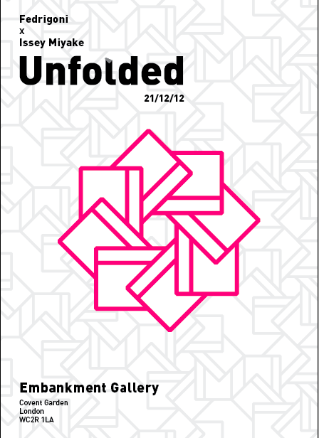
Final Promo Posters.
Finished the fedrigoni posters to the best of my ability i feel, really happy witt he designs and feel they promote both issey miyake and fedrigoni really well, need to photoshop them into action and i should be finished with them, i also want to print them just to see how the design would look in real life, sometimes on screen things can be deceiving.


Folded Poster.
Taking a different approach for the poster designs, using folds to promote the paper behind, this way it creates a nice aesthetic and also showcases the paper, I am liking these designs much more than the last, i feel they fit in well with the fashion industry and Issey Miayke's designs.
In order to create this i would need very lightweight coloured and white paper ans duplex them, i would love to have completed this brief with all the necessary tools and stocks, but for now i can just mock up the designs.

In order to create this i would need very lightweight coloured and white paper ans duplex them, i would love to have completed this brief with all the necessary tools and stocks, but for now i can just mock up the designs.

Promotional Posters.
Experimenting with some poster design and thinking of ways to include swatches and material the viewers can take away in order to gain awareness of the paper, these are just initial ideas and i will continue to develop further ideas more appropriate to the event.
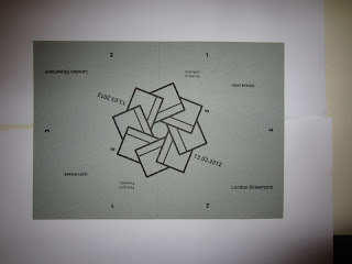
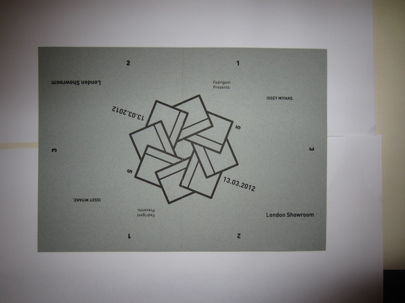
The 132 5 represents Issey Miyake's range of clothing, the 3rd poster is a representation of the paper being sliced through the middle with the corners folding out to showcase the paper underneath.


The 132 5 represents Issey Miyake's range of clothing, the 3rd poster is a representation of the paper being sliced through the middle with the corners folding out to showcase the paper underneath.


Saturday, 24 March 2012
132 5.
Exploring the shapes of vectors made based on the designs from 132 5, the vectors have turned out really nice, i will be using these as logo's and throughout the poster / invitation designs.
I experimented with patterns using the vectors, these also turned out really nice, i will continue to explore these images throughout posters and invitation designs.


I experimented with patterns using the vectors, these also turned out really nice, i will continue to explore these images throughout posters and invitation designs.


Subscribe to:
Posts (Atom)