Showing posts with label Good is. Show all posts
Showing posts with label Good is. Show all posts
Tuesday, 22 November 2011
Final deliverables printed.
Final deliverables, i think they come together very well, although everything didn't get printed on stock i wanted, i'm still happy with the aesthetics and overall quality of the products.
Proposal packaging.
Something i would have liked to tried, i would have simply screen printed the black logo onto the metallic packaging.
Printed Zine.
My final printed zine, happy with the design and stocks used, although two stocks had to be replaced, the tracing paper turned out better than expected but the cover was originally a deep blue card stock around 150 gsm with a soft texture and the antique white inside should have been a satin off white colour, unfortunately the blue cover jammed in the printer and i only had a couple of sheets, and the satin turned out to be too expensive.
i would have like to use a thicker black pulp stock with white speckle to give a more costly effec.
Final Poster Prints.
My final printed posters, turned out quite nice i particularly like the satin stock used, it does alot for the images and colours of the poster.
Zine Design.
A few sections of my zine i'm liking the simplicity and the formal feel to it, i will be using two stocks inside the book as well as a third for the cover, the two inside will be tracing paper (text) and antique white (images) i have yet to find a stock for the front cover yet and have still to finalise design ideas for the cover.
Poster Development cont.
The first three posters i feel work better than the fourth, it seems too busy and doesn't seem as neat.
After experimenting with different colour combinations in photoshop i feel these work best, the turquoise and deep maroon give a cosmic feel.
Poster Development.
A couple of new ideas I've tried i think the posters look much more effective without any text and also fit in with the rest of the designs.
Sunday, 20 November 2011
Further Poster Development cont.
I'm really liking the look of these posters the thin white stroke is subtle and works well, i just need to play around a bit more and decided on which images to use.
Further Poster Development.
Making good progress with the posters undecided on weather to use bright colours or duller ones, the
duller colours i feel look more antique which is a good representation for these billion year old super novas and nebula's.
duller colours i feel look more antique which is a good representation for these billion year old super novas and nebula's.
Poster Development.
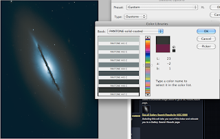
Experimenting with different duo tones in photoshop, i like the glow effect created with this i will continue development and hopefully come out with some nice designs for them.
Invitation Mock ups.
I much prefer the wallet-like invitations as apposed to be folded one, but i feel i need to develop this a lot further still, the colours and specific colours for the invitation i am simply experimenting.
Tuesday, 15 November 2011
Duo-Tone
Object Name: NGC 5866
Object Description: Lenticular Galaxy
Position (J2000): R.A. 15h 06m 29s.48
Dec. +55° 45' 47".2
Constellation: Draco
Distance: 44 million light-years (13.5 Megaparsecs)
Dimensions: This image is roughly 2.7 arcminutes (34,000 light-years or 10,000 parsecs) wide. The galaxy has a diameter of roughly 60,000 light- years (18,400 parsecs).
Subscribe to:
Posts (Atom)


