Showing posts with label Image. Show all posts
Showing posts with label Image. Show all posts
Friday, 20 April 2012
Book Printed.
Finally finished my book for the self initiate brief and it turned out better than expected, the colours all go very nice with each other including the cover, my only regret is i wish i had chosen the forest green colour as apposed to the grey colour, but as i said i'm still pleased with the out come, now i just need to print another and send it to my parents.
Sunday, 15 April 2012
Book PDF.
A PDF of the book i'm printing for the self initiated brief, really happy with the design, just wish i could spend more time making extras for various parts of the UK, i would also like to design a poster to go with the publication.
Unfortunately Issue wont let me have the correct view for the final PDF.
Unfortunately Issue wont let me have the correct view for the final PDF.
Saturday, 14 April 2012


Friday, 13 April 2012
Lake District Trails.
Lake District Trails.
Beginning to locate the 8 trails for my publication, i have specified the trails to The lake district, this makes it a lot easier to structure the book and choose specific trails.
I have decided to split the trails into 4 separate groups of difficulty, ranging from 1 to 8, These are the trails i will use.
1 . Longsledale Valley Blat cycle route.
'This is a not too technical, mainly off-road blast, up the Longsleddale Valley, which is ideal for those wanting a quiet, painless route with lots of scenery. It can take about 45mins in the dry, but there is also the option to take as long as you like and really enjoy the views.'


2 . Ambleside to Wray Castle and Hawkshead Hill Loop.


-
3 . Ambleside Circular via Loughrigg Off Road


4 . Staveley Shap Road.


5 . Whinlatter Loop from Thornthwaite


6 . Langdale Valley Circular.


7 . Buttermere Loop.


Beginning to locate the 8 trails for my publication, i have specified the trails to The lake district, this makes it a lot easier to structure the book and choose specific trails.
I have decided to split the trails into 4 separate groups of difficulty, ranging from 1 to 8, These are the trails i will use.
1 . Longsledale Valley Blat cycle route.
'This is a not too technical, mainly off-road blast, up the Longsleddale Valley, which is ideal for those wanting a quiet, painless route with lots of scenery. It can take about 45mins in the dry, but there is also the option to take as long as you like and really enjoy the views.'

2 . Ambleside to Wray Castle and Hawkshead Hill Loop.


-
3 . Ambleside Circular via Loughrigg Off Road

4 . Staveley Shap Road.


5 . Whinlatter Loop from Thornthwaite


6 . Langdale Valley Circular.

7 . Buttermere Loop.


8 . Elterwater Loop.


Thursday, 12 April 2012
Stock.
I have found some really nice stock to use for the cover of the book, the inside i decided to stick with white matte 130 gsm from the print room, i would liked to use something more like 90 gsm but i'm struggling to find anything close with a nice finish, the stock for the cover has a find tooth to it giving it a wonderful texture and subtle impact.
Not decided what to colour to go with as of yet but i have a select few choices of earthy colours again, if i am keeping the colour ways to green i would choose the green or grey to give the highest impact.

Not decided what to colour to go with as of yet but i have a select few choices of earthy colours again, if i am keeping the colour ways to green i would choose the green or grey to give the highest impact.

Type.
Considering typefaces and colour to use for this project, i want to explore more serif typefaces for this project while keeping a casual tone of voice and not making it too formal, i feel i have exploited san serif typefaces far too much recently and often disregard serif's.
For colour i would like to use earthy colours throughout and possibly only black and one other colour to keep the design minimal and create easy reading for the audience.
I can't help but pick green, it completely relevant and such a beautiful colour although the rest look really nice as well, black white and green go together perfectly.

As for the typeface i am going to use Georgia - Italic/Italic Bold throughout the book i considered using a sans typeface also but didnt think it would be relevant in the end, Georgia is a serif typeface but a friendly one also, this keeps the book from looking too formal.

Tuesday, 10 April 2012
Cumbria.
After a quick chat with my parents who informed me they decided to take a trip to the lake district for a weekend, also to do a few bike rides they enjoy, i felt it neccesary to have my book only showcasing trails around a specified area, and seen as though Cumbria is well known for all of it's terrain and beautiful sights it would be a perfect are to base my book on.


Monday, 9 April 2012
Bicycles.
Looking further into my self initiated brief for different routes to take, at first i wanted to create a zine/book showcasing various different types of bikes, their functions and styles but began to realise there are a lot of categories and sub categories also, thus creating a barrier in terms of design direction etc, i decided to round my idea to cycling routes around the UK.
I created 4 simple vectors to base my overall design around, these symbolise the difficulty from easy to hard.

I created 4 simple vectors to base my overall design around, these symbolise the difficulty from easy to hard.
Wednesday, 4 April 2012
Snellen Chart.
Eye chart.
My final printed eye chart, i felt it necessary to print onto tracing paper as it is similar to what is found for snellen charts, i also didnt feel any colour was needed.

My final printed eye chart, i felt it necessary to print onto tracing paper as it is similar to what is found for snellen charts, i also didnt feel any colour was needed.

Thursday, 22 March 2012
Saturday, 10 March 2012
3D.
3D.
'A bike flying gracefully'.
My reponse to the 2d - 3d - 2d, i cut a bike out of two different coloured stock to create an outline of a bike, i then added wings due to my drawing, i took the picture from below the bike in order to catch the sun beside it, i feel this gives a better representation of a flying bike.

Thursday, 8 March 2012
Colour. 2
Here are images of my final printed book, i wanted to keep the design minimal in order to showcase the gradient throughout, the screen prints were quite tricky to begin with as i havn't screen printed gradients before, over all i liked the aesthetic but feel more time spent on it i could have developed a better concept.


Saturday, 3 March 2012
Colour.
Setting up the screens for my book fair book, i have decided to further my ideas on light waves, looking at the different lengths of colour ranging from ultra violet to infra red, i want to create a continuing gradient throughout the book.


Friday, 2 March 2012
Bikes
Finalising my design for my Eye chart brief using parts of a bike, after revisiting this project i added a seat, handle bars, cogs and a shorted bike chain, i feel outlines for the parts give the greatest aesthetic and create a more recognisable image.


Thursday, 1 March 2012
Image. 05
Beginning our next Image brief No. 05, this one being a book for our college book fair, we have been asked to consider 4 areas and gather research for each one, the 4 areas are:
- Shape
- Sound
- Colour
- Typography
After gathering a wide range of research for all 4 areas we then need to focus down to one of the 4 and being further research developing a concept to design our book around.
Unfortunately i missed the taught session setting this brief which leaves me a little behind, i haven't developed any ideas or concepts as of yet, the few ideas that came to mind are:
Colour
Gradients, looking into natural gradients in our environment, focusing on things like gradients at dawn or dusk in the sky, gradients within the sea, gradients within forest etc.
Wavelengths, Colour is light and light works in wavelengths, visible light works from around 380 to 740 nanometers with a frequency range of about 405 THz to 790 THz, this is only a minute section of all colour wavelengths. In physics, the term light sometimes refers to electromagnetic radiation of any wavelength, whether visible or not.
Sound
1. Vibrations that travel through the air or another medium and can be heard when they reach a person's or animal's ear.
2. A long surgical probe, typically with a curved, blunt end.
3. A narrow stretch of water forming an inlet or connecting two wider areas of water such as two seas or a sea and a lake.
Looking into sound i want to experiment with the laws of sound, i.e. breaking the sound barrier, manipulating sound etc.
This could be an interesting area to explore due to the laws, these are laws that cannot be bent or changed but can be broken, i.e. things can travel faster than sound and also, in space there is no sound due to their being no air.
Shape
- Shape
- Sound
- Colour
- Typography
After gathering a wide range of research for all 4 areas we then need to focus down to one of the 4 and being further research developing a concept to design our book around.
Unfortunately i missed the taught session setting this brief which leaves me a little behind, i haven't developed any ideas or concepts as of yet, the few ideas that came to mind are:
Colour
| — n | |
| 1. | a. an attribute of things that results from the light they reflect, transmit, or emit in so far as this light causes a visual sensation that depends on its wavelengths |
| b. the aspect of visual perception by which an observer recognizes this attribute | |
| c. the quality of the light producing this aspect of visual perception | |
| d. ( as modifier ): colour vision | |
Gradients, looking into natural gradients in our environment, focusing on things like gradients at dawn or dusk in the sky, gradients within the sea, gradients within forest etc.
Wavelengths, Colour is light and light works in wavelengths, visible light works from around 380 to 740 nanometers with a frequency range of about 405 THz to 790 THz, this is only a minute section of all colour wavelengths. In physics, the term light sometimes refers to electromagnetic radiation of any wavelength, whether visible or not.
Sound
1. Vibrations that travel through the air or another medium and can be heard when they reach a person's or animal's ear.
2. A long surgical probe, typically with a curved, blunt end.
3. A narrow stretch of water forming an inlet or connecting two wider areas of water such as two seas or a sea and a lake.
Looking into sound i want to experiment with the laws of sound, i.e. breaking the sound barrier, manipulating sound etc.
This could be an interesting area to explore due to the laws, these are laws that cannot be bent or changed but can be broken, i.e. things can travel faster than sound and also, in space there is no sound due to their being no air.
Shape
1. the quality of a distinct object or body in having an external surface or outline of specific form or figure.
2. this quality as found in some individual object or body form: This lake has a peculiar shape.
3. something seen in outline, as in silhouette: A vague shape appeared through the mist.
4. an imaginary form; phantom.
5. an assumed appearance; guise: an angel in the shape of a woman.
External Appearence, With shape i could explore the definition, an external surface or outline of a specific form, from this i can explore objects we do not know the internal source only the external, showing how something so simple can be investigated and much more detailed and complex forms can be found inside.
Circle, the perfect shape, infinate sides no corners, i would like to explore how there are naturally formed circles, i.e. the sun, planets, orbits.
Orbits, An orbit always creates a shape usually a symmetrical shape and usually a constant path for an object weather it be a planet or an asteroid or a galaxy.
Paths, A path is a shape in which objects use to follow, if its a person, a car, a train etc, a path usually ends at the beginning creating a shape.
Saturday, 18 February 2012

Type as Image.
My second type as image poster involved using the word reaction in a scientific term, i wanted the imagery to symbolise compounds in chemistry, i feel it worked quite effectively and puts across my concept clearly.


Friday, 17 February 2012
Type as image.
My first Type as image poster, keeping a minimal style and using letters from the quote to create a simple representation.
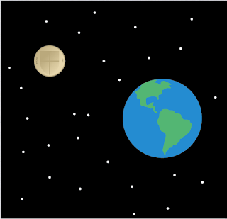
I used the two 'oo's in Moon to represent the earth and moon, i decided to use the third poster as it takes up more of the format.


I used the two 'oo's in Moon to represent the earth and moon, i decided to use the third poster as it takes up more of the format.


Sunday, 5 February 2012
Image 3.
after looking into bikes and realising i was running out of time, i designed my eye chart test using a disected bike, my original plan was to vector a single wheel from 10 bikes since the first bike was invented, i immediately ran into a problem with expressing each bike without colour, since we could only use stock + one colour.
Another idea i had which i will further once i have more time, is to vector a single wheel of as many types of bikes i can, bmx, road, mountain etc.


Another idea i had which i will further once i have more time, is to vector a single wheel of as many types of bikes i can, bmx, road, mountain etc.


Thursday, 2 February 2012
Editorial.
My final Designs for the Editorial brief.
In response i wanted to create simple ideas in order to give an overall feel for the articles, mostly vector based with minimal colour.
I felt the most appropriate route to take in terms of ideas was that Exercise helps maintain a strong immune system weather your old or young, the final idea was to have a stamp saying Exercise on top of a doctors prescription.

The second symbolising the difference in size between a pound coin and the earth due to the article explaining how as the human race we can't differentiate between numbers such as a million and a trillion.

Here are the three images along with the articles.


In response i wanted to create simple ideas in order to give an overall feel for the articles, mostly vector based with minimal colour.
I felt the most appropriate route to take in terms of ideas was that Exercise helps maintain a strong immune system weather your old or young, the final idea was to have a stamp saying Exercise on top of a doctors prescription.

The second symbolising the difference in size between a pound coin and the earth due to the article explaining how as the human race we can't differentiate between numbers such as a million and a trillion.

And the third incorporating the word love into a computer environment using binary code, the article is about relationship online.
Here are the three images along with the articles.


Subscribe to:
Posts (Atom)