Thursday 17 March 2011

InDesign. Work shop tutorial 2.


to fit an image inside some text you must select the image and click text wrap, the icon shown above, you then can open text wrapping in the window menu and change the border around the image.


.


this can also be used for pull quotes.


changing text inside an image using text frame options.


.


Communication is a virus: Questionnaire

Having being a lad i have played poker with friends quite a bit, not so much nowadays though, we never really used to bluff but i know if i played now i would, i put together a quick questionnaire for people i know play poker from manchester, just to get an idea of how they saw bluffing.


.


Thursday 10 March 2011

InDesign. Work shop tutorial.


Facing Pages: you use facing pages if what your producing is going to be a book, i.e. pages that face in a book, if somethings printed on both sides you still don't need to use facing pages. Margins change from inside / outside margins to left / right.

Bleed: this is used for images to make sure when you trim your work there isn't any white boarders around it, the image will go bigger than the edge of the actual document to avoid this.


Fill with 'placehold text' enables you to fill the box with preset text so you can adjust type size, font type and colour without filling all your details in first.


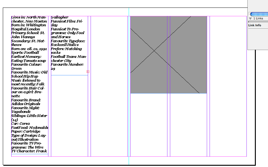
The small red cross in the box at the bottom right hand corner indicates there is text that cannot be shown  due to lack of space.


by double clicking the small red box it expands the missing text into and extra box, and by reducing the size of one text box it expands one other.


If i Select 3 different text boxes then select fill with text, it will automatically distribute the text evenly.

the easiest way to make a double page spread is to make the document the size of both pages put together i.e. A3 x 2 = 380 x 237 then put a ruler in the middle of the document splitting it into 2 documents.

When inserting a photoshop document into an InDesign they should be saved as either a tiff. files or a PSD. photoshop document. Also the colour mode should be CMYK because were working to print, or Greyscale images.
Resolution is another thing you must make sure is correct, images should be 300 dpi. and Actual size.


When inserting any Illustrator files into an InDesign document the files format must be ai. files, colour mode again should be CMYK.

Make sure all images you use in an InDesign document are in the same folder.


.


The links palette is used for InDesign to show were each image you insert into the document.


The Display performance option in InDesign changes the display of the image your linking into the document, fast display only displays a grey box and high display obviously displays a good quality image.


Fast displayed images.


Experimenting with colour filters using simple blocks of colour and opacity settings.


Tuesday 8 March 2011

Opposites: Final Mock up Print outs


I am happy with the final mock up print outs of my designs, i would like to print the actual final pieces onto newsprint to give it a nicer effect, the only problem i may run into with news print is the colour, with the opacity being low it may make the colour a fair bit different, ill just have to wait and hope it doesn't. 


Monday 7 March 2011

Opposites: Final Designs


This is the development for my final posters after my final crit i decided to make then more simple and used less imagery due to the competition being a typographic brief.

In Design Workshop: Yafet Bisrat


Lives in: North Manchester, New Moston
Born in: Whitington Hospital London
Primary School: St. John Viannys
Secondary: St. Matthews
Born on: 08. 01. 1991
Sports: Football
Earliest Memory: Eating Tomato soup
Favourite Colour: Green
Favourite Music: Old School Hip Hop
Music listened to most recently: Folk
Favourite Hair Colour on a girl: Brunette
Favourite Brand: Adidas Originals
Favourite Night: Vagabondz
Siblings: Little Sister (14)
Car: Corsa
FastFood: Mcdonalds
Paper: Cartridge
Type of Design: Layout/Illustration
Favourite TV Programme: The Wire
TV Character: Frank Gallagher
Funniest Film: Friday
Funniest Tv Programme: Only Fool and Horses
Favourite Typeface: Rockwell Italics
Prefers: Matching socks
Football Team: Manchester City
Favourite Number: 29

Xbox // Playstation
Tie // Bowtie
Rubicon: Mango // Guava
City: Manchester // Leeds
Cat // Dog
Pen  // Pencil
Chair // Sofa
Earphones // Headphones
Sweatshirt // Hoodie
Circle // Square


Sunday 6 March 2011

Opposites: final crit.


My thumbnail print outs and Crit analysis sheet, after the crit i realised i needed to change a few things such as my focus on the actual content and layout a bit more.

.

Book Fair: screen printing and prints


my black and white print outs to be exposed on my screen.

.


washing the screens and leaving them to dry
.


my final 10 prints including 8 extra, some are not quite perfect but i really enjoyed screen printing and hope to do it a lot more over the next three years

.


These are my practise prints to make sure every thing was ok, at first the ink dried quite fast on the screen so i had to print around 30 prints to get the ink running through properly again, ill make sure i don't mess around when i start printing next time.

.