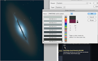
Making good progress with the posters undecided on weather to use bright colours or duller ones, the
duller colours i feel look more antique which is a good representation for these billion year old super novas and nebula's.
Sunday, 20 November 2011
Poster Development.
Experimenting with different duo tones in photoshop, i like the glow effect created with this i will continue development and hopefully come out with some nice designs for them.
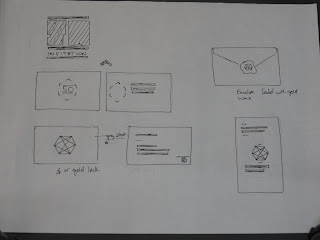
Invitation Mock ups.
I much prefer the wallet-like invitations as apposed to be folded one, but i feel i need to develop this a lot further still, the colours and specific colours for the invitation i am simply experimenting.
Design Sheets.
Experimenting with different ways to design invitations and possible packaging for a gold plaque, i dont feel the hexagon packaging is necessary due to the logo also being hexagon.
Some poster design i'm not going to use these, i think a more visual approach in terms of using nasa's photographs of the universe is more appropriate, also the images are good enough themselves to be poster.
I think the wax seal is a bit to old to use in this project i feel a more modern printing approach would be more fitting.
Designs for a poster tube, id like to design my own hexagonal tube and think it would be an interesting approach to packaging.
The design for my zine is coming together nicely, i'm going to follow this idea and expand from it.
Tuesday, 15 November 2011
Duo-Tone
Object Name: NGC 5866
Object Description: Lenticular Galaxy
Position (J2000): R.A. 15h 06m 29s.48
Dec. +55° 45' 47".2
Constellation: Draco
Distance: 44 million light-years (13.5 Megaparsecs)
Dimensions: This image is roughly 2.7 arcminutes (34,000 light-years or 10,000 parsecs) wide. The galaxy has a diameter of roughly 60,000 light- years (18,400 parsecs).
Thursday, 10 November 2011
Type Session 3. pt 2
How to make the text easier for older people to read (people with sight problems).
The ways we can do this is to adjust the point size, leading and we can remove spaces from inbetween paragraphs
You cannot reduce the leading, you can only increase it!
Don't take out indents on paragraphs.
The reason we keep indents with paragraphs as well as it helping show people theres a new paragraph it also makes it look like theres less text.
We have been given a page of text and asked to make it as legible as we can using the skills we have learnt.
I chose 3 columns, Arial 10 on 14.1.
And then include a picture, personally i should have used a bigger picture, but i feel the text works well and is legible.
The next task consisted of the same rules apart from the document being landscape this time.
With this task we had to use all of the text and image but keeping to the considerations learnt through the sessions.
Type session 3. pt 1
- Task 1.
We are given a paragraph and asked to fit it into the column as perfect as we could changing the point size, the size used is 10.74 which makes the leading 12.888.
We were then asked to duplicate the text 4 times in each column reducing each columns point size by 1pt. then to change the leading in order the fit the text perfectly in the box.
The correct terminology for point size and leading you would say '12 on 13' meaning 'point size on leading'.
When asked to select the most legible column due to change in point size and leading, column 2 seems to have the most legibility to me, column 3 has too much space inbetween lines and column 1 seems to cramped.
Automatic leading should always be change to improve legibility.
-
Column 1 - 9.74 on 14.6
Column 2 - 9.74 on 14.6
Column 3 - 9.74 on 14.6
Column 4 - 9.74 on 14.6
Using width size to improve legibility, Column 1 is nearly impossible to read, Column 3 seems the be the easiest to read, the reason 4 is harder to read is that by the time you eyes reaches the end of the line your reading you loose track of were the next line starts due to the length of it.
A rule of thumb with type:
- You never go below 5 or 6 words on a line, roughly 36 characters.
- You never go over 11 or 12 words on a line.
Experimenting with changing the typeface, weight and alignment.
Typeface
Weight
Alignment
- aligned left is also known as 'ragged right'
* Justifying text makes it smaller.
Subscribe to:
Posts (Atom)


