Monday 31 October 2011

Print Trip - Target

Wednesday 12th October.

For help with our ongoing brief 'what is design for print' a print visit was arrange by our year tutor.
After the visit i feel far more knowledgable about print now and wouldn't mind taking an other visit to a different warehouse just for a bit more experience.

Litho Printing.


Is a six colour printing machine that uses CMYK, and also 2 more spot colours.

- The image/images are etched onto a plate.
- 4 different plates one for each colour - C/M/Y/K.
- The plates are attached onto different sections of the machine.
- The paper is lifted using small suction pads.
- It is then fed into the print passing through each section were the ink is pressed from the plated to the rubber roller and from there onto the paper, this is because the plates would wear down easily if it was straight from the plates.
- Ink is added to each section by hand, fed into the top of the machine.
- Prints are regularly checked to make sure the registration marks are aligned properly.
- At the end of the process starch is sprayed onto the paper to stop them from sticking together (the starch is so fine you cannot see or feel it, therefore not damaging the prints).
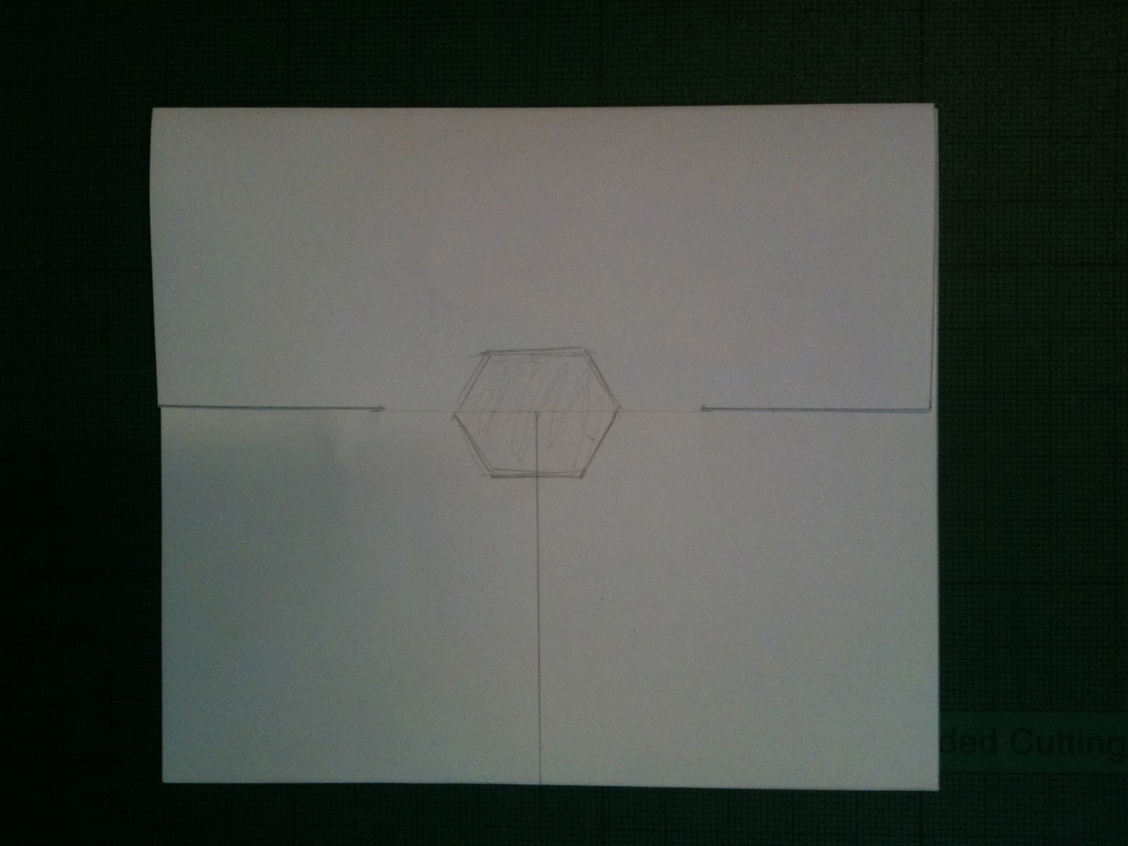


-


Die Cutting.


Die cutting is another print method used by Target.

- The Die cutting shapes are made by hand from another company working along side target.
- The shapes are cut out by this machine pressing them onto paper.


Thursday 20 October 2011

Print Formats - Methods - Considerations

Format - Method - Considerations.


5 Print formats

1 - Hexagonal Packaging 
2 - A0/1 Posters 
3 - Banners outside Museum
4 - 2:1 A3 posters 
5 - Zine


5 Print methods

1 - Screen Print onto foil
2 - Screen Print onto paper
3 - Foiling onto paper
4 - Debossing
5 - Laser Print

5 Print considerations

1 - Cost
2 - Difficult to get hold of stock
3 - Finishing Foiling
4 - Screen Printing
5 - Time

Rationale Re-Write

Rationale


Good is the James Webb space telescopes Primary Mirror

-


Why?

1.  6.5 meters in diameter

2. Gold platted for infrared purposes

3. Each 1/18th hexagonal segment weighs 20 kilos

4. The mirror unfolds 18 segments from 3 sections, this is to fit the space telescope onto the space shuttle

5. Each mirror piece moves individually controlled by 6 actuators attached to the back

-

I Intend to Inform & Educate the public about the James Webb space telescope through advertisement and promotion of the existence and possibly a fictional date for the launch of the telescope.

In order to achieve this i will produce a series of print based designs to advertise and promote the telescope.

Product - What is your product?


- Promotional and informative design for the launch of the telescope.


Range - what range of deliverables will you produce/propose


- A series of posters to promote the launch.
- a small book / zine with information of the telescope.
- Packaging for zines and promotional media
Contextual References


- Nasa Worm logo (1970')
- Nasa Food Packaging
- Design of the JW Space telescope

The Context in which your products will be seen/exists


- Universities
- Libraries
- Museums
- Space Centre
- Internet

Tuesday 18 October 2011

Rationale - What is Good?

Rationale


Good is the James Webb space telescopes Primary Mirror

-


Why?

1.  6.5 meters in diameter

2. Gold platted for infrared purposes

3. Each 1/18th hexagonal segment weighs 20 kilos

4. The mirror unfolds 18 segments from 3 sections, this is to fit the space telescope onto the space shuttle

5. Each mirror piece moves individually controlled by 6 actuators attached to the back

-

I Intend to Inform & Educate the public about the James Webb space telescope through advertisement and promotion of the existence.

In order to achieve this i will produce a series of print based designs to advertise and promote the telescope.

Product - What is your product?


- Promotional and informative design for the launch of the telescope.


Range - what range of deliverables will you produce/propose


- A series of posters to promote the launch.
- a small book / zine with information of the telescope.

Contextual References


- Nasa Worm logo (1970')
- Design of the JW Space telescope

The Context in which your products will be seen/exists


- Universities
- Libraries

Wednesday 12 October 2011

Packaging cont.

I decided to stick with the hexagon logo and try to incorporate some type into my designs also, i don't feel my designs need too much type as i would like to keep it quite simple and professional.


I like the feel of the pattern too, i would like to find an individual typeface for this project too, to give it a more personal feel, i think an important part of brand identity is individuality.

Here are the finished and printed versions of my packaging.


Packaging Development


Here are some rough sketches and initial design ideas for my packaging, unfortunately the pictures i had taken turned out a lot darker than i thought so these aren't the best images but hopefully they get my ideas across.


Logos development

Taking my Inspiration initially from the typeface Braggadocio, i started with the letter forms 'W' and 'M' in illustrator and began to develop them further from their.

I didn't want to keep just the typeface for this project, i felt like i should further expand with my ideas and create a more personal logo so i began to play around with different shapes and sizes.


After selecting what i thought to be the most appropriate letter forms i then began to work with different layout, including text and symbols.


I found the text to some what 'kill' the design i didn't like the way it worked i feel a simpler approach to the design would be more fitting.

I am fairly happy with the way these designs turned out i feel they need more work and development still, i still would like to include some type to give it more meaning.

Logo Development and Packaging

After receiving feedback from my peers i made some adjustments to my logo.

I began by hand rendering my initial logos and vary the ideas develop them into more appropriate logos.


Logo Designs cont.

Critique.

We were told as a class to lay out all of our logo designs and then select our favourite ten.


After we had done that, each table of five people switched to the closest table to then crit each persons work and choose a logo out of their favourite ten.

I received some feedback as well as my selected logo.


  • Visually pleasing / stands out
  • Applies relevant info of how telescope is set up, also using appropriate letterform

Things to improve.

  • Include more text, possibly a slogan
  • Experiment with density of shape
  • Try different compositions