I didn't want to keep just the typeface for this project, i felt like i should further expand with my ideas and create a more personal logo so i began to play around with different shapes and sizes.


After selecting what i thought to be the most appropriate letter forms i then began to work with different layout, including text and symbols.
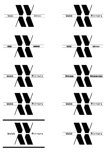
I found the text to some what 'kill' the design i didn't like the way it worked i feel a simpler approach to the design would be more fitting.

I am fairly happy with the way these designs turned out i feel they need more work and development still, i still would like to include some type to give it more meaning.
No comments:
Post a Comment