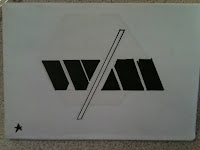
We were told as a class to lay out all of our logo designs and then select our favourite ten.
After we had done that, each table of five people switched to the closest table to then crit each persons work and choose a logo out of their favourite ten.
I received some feedback as well as my selected logo.
- Visually pleasing / stands out
- Applies relevant info of how telescope is set up, also using appropriate letterform
Things to improve.
- Include more text, possibly a slogan
- Experiment with density of shape
- Try different compositions


No comments:
Post a Comment