Revisited the design of my publication, with the imagery placed purposefully and the type aligned to various images on the page, I also included the years running along the right hand side as a timeline, I am going to carry this aesthetic across to my image publication with a few minor adjustments.
I am feeling a lot more confident about this publication now, for the aesthetic I will be using a simple colour difference for the cover of the books and some form of packaging, at the minute i would like to find a foiled envelope to give the publication a space aesthetic, relating to food packaging you see in space.
2nd book
Tuesday, 30 October 2012
Monday, 29 October 2012
Timeline publication.
To represent the date of the events I will position the year along the side and as the audience reads through the publication the text will move up the side of the page, I will go from 1917 to 1993 in the first publication, the second will then take over from 1993 to 2012, when the first is placed below the second it will be a continuing timeline, from the concept being born until the present.
timelines
timelines
Sunday, 28 October 2012
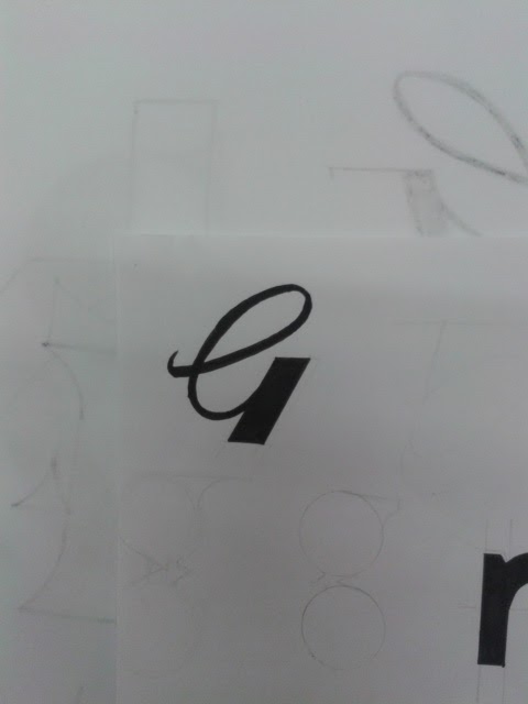
Script 2.
Experimenting with different G's for Gent No. 5 logo, looking into how i can bring 5 into the logo also. The G5 logo is the strongest but I'm unsure weather to continue with this idea, the serif logo is looking much more masculine and considered, this logo could be mistake for various other professions. I will continue work on the serif and San serif ideas to see which one i prefer.


Saturday, 27 October 2012
Various input.
Finally developed a concept for the image layout in my book, each image will be flush to the edge the publication to represent the collated input from various different areas that helped complete the telescope, this also gives the book a nice aesthetic and gives me a chance to align the text and images in an interesting way.
various input
various input
Sans.
Exploring another option for Gent No. 5, this time focusing more on brands such as Toni & Guy with a more up to date aesthetic, i created my own set of letters for a typeface idea where by the cutting away aesthetic is still used but on a Sans serif typeface rather than a Serif, i feel this works really well in creating a masculine look again i still need to explore this idea further to see how far i can push it. These are the designs i have created so far.


The G i designed looks similar to a pair of scissors, while this is a very obvious idea if i spend enough time re working it, it could turn out to be very effective.


The G i designed looks similar to a pair of scissors, while this is a very obvious idea if i spend enough time re working it, it could turn out to be very effective.
Friday, 26 October 2012
Layout.
Experimenting with how to position the type and image throughout my book, at the minute I am just playing around with layout and seeing if any ideas for concepts spring to mind, Din seems like a fitting typeface for this project as it is well structured and great for legibility, this is a main concern due to the amount of information in this publication, having the dates running up the side of the publication could be a nice idea for showing when the events happened.
layout exp
layout exp
Serif.
Following another possible option for Gent brief, sticking with the concept of creating an identity that's traditional with a modern aesthetic, i want to take a Serif typeface and manipulate it to create a more modern look, also looking at eliminating parts as to cut away from the type. I like the direction this idea is going it will take a while to get each letter fitting together.


Again i added borders to some of these logo's but feel it takes away the masculinity of the logo, without the border the logo stands alone and represents the traditional male feel.


Again i added borders to some of these logo's but feel it takes away the masculinity of the logo, without the border the logo stands alone and represents the traditional male feel.
Subscribe to:
Posts (Atom)