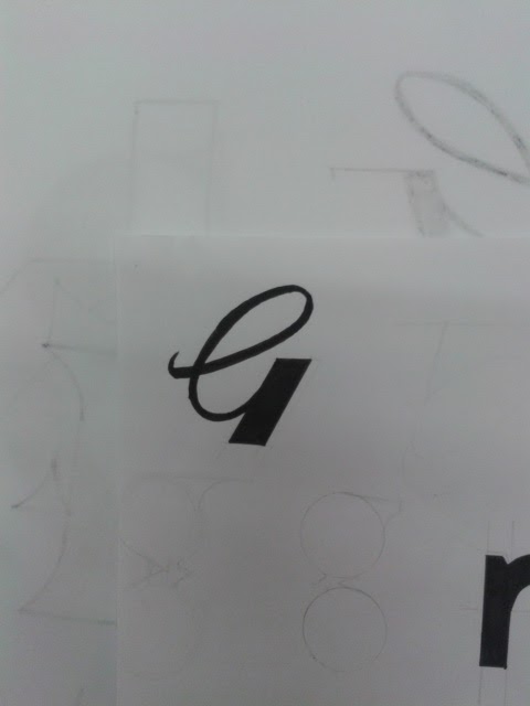
Experimenting with different G's for Gent No. 5 logo, looking into how i can bring 5 into the logo also. The G5 logo is the strongest but I'm unsure weather to continue with this idea, the serif logo is looking much more masculine and considered, this logo could be mistake for various other professions. I will continue work on the serif and San serif ideas to see which one i prefer.


No comments:
Post a Comment