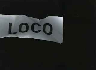
Thinking of how i could manipulate the word loco to look a bit more mad and obscure and decided to play around with the scanners around college, i used Din to create a simple block letter logo and began running it through the scanners using folds to create an warped aesthetic, it didn't turn out as well as i'd hoped but if i keep reworking it with maybe less folds and more considered folds, also using a more geometric structure for the letters would give the logo an edgier feel.


No comments:
Post a Comment