Wednesday, 12 December 2012
Tuesday, 11 December 2012
Sunday, 9 December 2012
Final crit.
Received some really good feedback for once, I think it was mainly due to my group, Charlotte, Yaf and Matt Chatfield are great at feedback they write much more than 'it's nice that'. I need to consider how to carry a similar aesthetic across the boards so they relate, also how I'm laying my images out and I'm learning but I often use 'i' instead of 'I', people always point it out.
Final Crit
Final Crit
Saturday, 8 December 2012
Friday, 7 December 2012
Thursday, 6 December 2012
Monday, 3 December 2012
Printed.
Eventually got my Gent project printed, the stock I used was subtly embossed with stripes which gave the project a more sophisticated feel, I also duplex a few of the range. All in all really happy with the project.
printed range
printed range
Mock website.
To further my deliverables I created a simple mock website, again I wish I had more time but my other briefs need sorting out still, I used a simple layout, easy to access all parts and used lines throughout to break up the page.
web
web
Printed.
I am happy with how fast I've completed this brief, although it's not up to my usual standard the range fits together and the design comes across commercial, I couldn't spend much on stock due to my funds but it turned out alright in the end.
Final range
Final range
Range.
Although it's small this is my range for Laserbean I have designed business cards, letterheads and a services card, I have also designed a mock website which I will post shortly after this, I wish I had more time on this brief there is a lot more I would do with it, I can't even laser cut the logo into anything as I don't have the time or funds, I may re visit this brief for FMP or brand a similar idea.
Range
Range
Sunday, 2 December 2012
Business Card.
Applying my decided logo onto business cards to find a suitable aesthetic for my range. My colour choice will be a pinky orange, almost infra red, in order to represent the light waves sent through the laser (infra red), and my typeface choice is Eurostile as it has a solid structure and looks industrial representing the fact Laserbean can perform huge tasks with various solid materials.
Busines card
Busines card
Saturday, 1 December 2012
Duplex.
I decided to add a little extra aesthetic to my business and appointment cards to create a more upmarket touch to the designs by duplexing them, the outcome was great and I think it fits perfectly with the rest of the aesthetics.


Final Logo.
I have now decided on a final logo, I feel this logo contains an interesting complex yet simple aesthetic, it can be applied through laser cutting easily and has a commercial feel to it, I am fairly happy with it but with more time would have explore other concepts and developed more ideas.

Friday, 30 November 2012
Choice.
I'm really starting to enjoy this brief now but unfortunately I have very little time left, although we have a couple of weeks I've got a lot of catching up to do with other projects. I have to pick a logo very soon as this should only be a week brief, these are the logo's appealing to me the most so far.
What I have taken into consideration:
- Simplicity
- Commercial Aethetic
- Colour
- Ability to be laser cut
- Structure
choice
What I have taken into consideration:
- Simplicity
- Commercial Aethetic
- Colour
- Ability to be laser cut
- Structure
choice
Thursday, 29 November 2012
Molecular.
A variation of logo's for Laser bean focusing on the molecular process behind the function of their machines, I really like some of these ideas but due to their form they woulnd't be able to be laser cut into much as parts of the logo would fall through, it is important I create a logo that will sit nicely when laser cut.
Logo3
Logo3
Vectored 2.
Exploring possible logo vectors and experimenting with variations to see what visuals I can create, these again use very basic shapes, I don't want to over complicate the aesthetic and take away it's commercial value, Laserbean want to appeal to a wide range of audiences so I need create a simple clear identity.
vectorVECTOR
vectorVECTOR
Vectored.
Taking some of my sketches for Laserbean onto the computer, just experimenting for now and seeing how I can create interesting variations of my hand rendered ideas, focusing mainly on simple shapes representing how a laser operates with pulses, these are very basics ideas and no way near finished, the company also asked for interesting icons to use as a logo. I'm going to start experimenting with patterns of simple vectors so the company will be able to show off their laser cutting skills by using it within their designs.
vec
Logo2
vec
Logo2
Wednesday, 28 November 2012
Laserbean.
I would like to make the laserbean project a very short one, at the minute for logo designs I will be focusing on three ideas, the molecular process of the machine, visuals representing a laser, and minimal design using simple shapes found within laser cutting.
Logo
Logo
Monday, 26 November 2012
Laserbean.
It is very late for me to be starting my final brief but i have been very caught up with other briefs recently and haven't had the time, also i have decided to change the brief as my previous idea was more for me to create pretty looking T-shirts apposed to creating a strong concept around a brand, i found this brief online, it is a competition brief but has now ended.
http://www.mycroburst.com/contests/logo-design-for-exciting-new-company-laserbean/readbrief


I have re-written the brief as follows.
Brief
Design the brand identity for Laserbean, a company that specialises in Co2 laser cutting machines.
Background / Considerations
I aim to create the brand identity for Laserbean using clean minimal design to execute a high impact logo , focusing mainly on the molecular process of a Co2 laser cutting machine
Maintain a very professional feel throughout with technical aesthetics where necessary.
Mandatory Requirements
› Explore the technical process the machine goes through
› Explore how the machine works on a atomic level
› Explore a range of print processes
› Appropriate use of typography
Deliverables
› Logo
› Website
› Business cards
› App
› Letterheads
› Promotional material
› Price list
Thursday, 22 November 2012
Wednesday, 21 November 2012
Mock website.
I mocked the website design I did onto Mac screens to see how they work, very happy with the look and hopefully I can find a coder to sort the website out for me.
Mock Web
Mock Web
T shirts final.
Our final selected T shirt designs, using again the artwork Dom created to carry the aesthetic through the range.


Tuesday, 20 November 2012
Slang walls.
Applying the Phonetic slang to the interior of my clients shop using photoshop, I wanted to do this to create a continuing aesthetic to my clients brand, I really like the way the colour sits on the wall, hopefully my client will use take this idea off me and allow me to have some fun in his shop.
Slang
Slang
Sticker applied.
Testing the sticker on the gloss silver packaging to see how it sits before I apply it to my chosen matt envelop, really happy with the result, I'm definitely going to use this.


Sticker.
Just to give the envelopes a finishing touch I decided to add a small sticker, it felt like it was missing something earlier, the simplicity of the envelope compliments the sticker so well, I'm really happy with this project it has come together so nicely so far and I'm getting really involved with it.

Monday, 19 November 2012
Printed Calendar.
I also printed my calendar out today, really happy with the result, again using the light weight double sided gloss to emphasise the imagery and too not bulk out the calendar too much.
Printed calendar
Printed calendar
Printed tear out.
I printed the tear out image onto the same stock used throughout the publication, I chose double sided gloss as to show off the imagery in the publication as best as possible, it is also very light weight giving it a great feel.


Website final.
Finished my website, I wanted to wait until i finialised the designs for the rest of my project before tackling it, I needed to make sure i had a solid aesthetic for this project before begining the website as a lot has to go into it, I wanted to carry on the friendly northerner concept on the website as it will be one of the most accessed parts of my clients business.
I kept the design minimal and easily accessible, using extra parts to the design such as the barber shop stripes etc.
webdings
I kept the design minimal and easily accessible, using extra parts to the design such as the barber shop stripes etc.
webdings
Sunday, 18 November 2012
Calander.
I'm feeling as though this project might not be bulky enough, as it's a publication it doesn't need much of a range but I'd like to include something extra for the audience, I thought the best way to celebrate the images taken by Hubble would be to produce a simple calendar using Hubble imagery, I will also perforate the calendar so when the month has passed the user can keep the image for a small poster or frame it.
I decided to use the highest resolution imagery from Hubble's gallery to emphasise the quality of the telescope.
Calendar
I decided to use the highest resolution imagery from Hubble's gallery to emphasise the quality of the telescope.
Calendar
Tear out.
I always intended on having smaller inserts throughout the book but felt I could have easily over done it, I then completely forgot about it, luckily I was able to design a simple tear out poster for the reader due to the publication being bound with metal filing clips. Just a simple one with a description of the object, which of Hubble's instruments took the photograph and what team found it.
Tear out
Tear out
Loyalty final.
Another deliverable finalised in keeping with the rest of the range, I still need to finish opening times, Website and appointment card, not a big task really, especially now I have a solid aesthetic sorted.
loyalty card
loyalty card
Price Final
The final Designs for the price list of Gent No. 5 really happy with the designs, I will use two different stocks for this, the cover will be a slightly embossed off white paper and the inside with the prices on will be thin double sided off white gloss, hopefully adding this finishing touch will give the project the high class aesthetic I have been after.
Prices
Prices
Saturday, 17 November 2012
Wristbands.
Almost forgot about these little gems, I thought it would be a nice idea to create wristbands for the night that people could take away like a piece of artwork, so I applied the artwork Dom create to them to see how they looked and was really happy with the result, it just gives the night yet another element over all other nights. I'm not sure how costly it would be to do but we'll have to wait and see when our client sets up the night.
Wristbands
Wristbands
Final business card.
I have now decided on the final aesthetic for this brand, I will be using a fine burgundy border around the type for my full range, with Bauer bodoni for header text and Futura Std light for the body text, this is my final business card design, I feel i have achieved a combination of a modern and traditional aesthetic and quite happy with the turn out, I need to get my hands on scissors, a brush and a comb to bring all the design together at the end and put it into context.
open 2
open 2
Friday, 16 November 2012
Blank pages.
Nightmare earlier, I printed my A5 book without crop marks which meant i had to print it again, like an idiot the second time I printed it I forgot to click 'print blank pages' which meant all the pages rearranged and I didn't realise until I carefully cut them all out, luckily it didn't happen with my A4 as it would have set me back in terms of funds.
Blank pages
Blank pages
Envelopes.
By far the most exciting part of this module so far, receiveing the envelopes I ordered, finally I found an english website selling foiled envelopes and I love them all, they will give the project to finishing touch. As stated many times the fundamental part of this project is to create a space themed aesthetic all around, involving the reader with the whole journey, every step of the project opens new aesthetics relating to space and the telescope.
I order 5 all together, black gold and silver shiny envelopes and black and silver matt ones, the matt envelopes are my favourite, the shinier ones come across a little too tacky for my liking. I think i'm going to use the silver matt ones as they sit perfectly with the black and navy covers for the book, creating a lovely contrast. I will be applying a sticker to the envelope, something simple, maybe even just 'The Hubble space telescope'.
envelopes
Opening Times 2.
Updated opening times again maintaining the same aesthetic, although the text is black I am proposing to create vinyl stickers to go on my clients door with a red border and white text, I still need to take pictures of his front door to photoshop the design to, I also need to photograph the inside of his shop to propose the rest of the interior branding.
open 2
open 2
Loyalty 1.
Again experimenting with subtle variations for the loyalty cards, nothing major just changing line widths etc. this colour scheme will be carried through the range and the typeface etc. really starting to like the look of this project now, a little more tweaking and I should be ready for print.
Loyalty 1
Loyalty 1
Business 3.
Continuing to develop business card ideas to form the base aesthetic I will apply over my range, I'm really liking the northern slang idea I just need to decide on what quotes are relevant for each deliverable, these variations are only for the layout of the business card, once the aesthetic is sorted I'll brainstorm ideas for quotes.
BC IDEAS
BC IDEAS
Thursday, 15 November 2012
Styling range.
To extend my Gent range I decided to design some male grooming products, hair gel and styling wax seemed fitting. Using the same aesthetic through my project and continuing with the phonetic language idea with a minimal aesthetic.
Styling
Styling
Price list.
A few variations of the price list for Gent, again using futura std light for body text to keep the contemporary feel running through the project, I will be adding a quote from my client, 'What y'avin then?' due to it's relevancy, undecided weather to use the logo on the front or 'Price list', I usually over apply my logo to branding projects rather than creating an aesthetic that reflects the identity, this is something I want to focus on more this year.
price list
price list
Wednesday, 14 November 2012
Opening times.
Experimenting with a few different opening times signs, keeping the aesthetic consistent with the new business card designs, I still feel they need more to them, I will carry on designing simpler deliverables to get an idea of the design rather than jumping into things like this.
open 1
open 1
Business cards 2.
Beginning to apply the new designed logo to business cards, i feel adding a thin box line around the logo gives a more sophisticated feel to the designs and finishes it off, this is also something i can carry across my range to bring the project together, at first my client asked for just black and white but he has been very co-operative so far in letting me do almost what i want, so when i suggested adding a touch of colour he was happy for me to do this. In terms of a typeface i am going to stick with Futura for the No. 5 as it brings a more contemporary aesthetic into the design.
gent Bis
gent Bis
Second.
The second of two publications now finished, this one was fairly easy as the design is carried throughout from the first publication, with minor differences such as image layout, really happy with the two together, especially one being A4 and the other A5. I designed the A4 at this format as to show off the imagery taken by Hubble over the years, this also gives the reader the opportunity to see how the images went from being pixelated to as crisp as they can.
Second
Second
Tuesday, 13 November 2012
Stickers
Me and Dom decided to extend the projects range by proposing Loco becomes a record label at some point, we discussed this with our client and he said he would like this to happen eventually any so it works our for both of us. I was designated to design the stickers for the ring of the vinyl and the record sleeve. I designed them using the artwork we had agreed on and the result was brilliant, I also considered how the artwork would react with the vinyl spinning on the decks. These are the final printed stickers
Sticker
Sticker
Monday, 12 November 2012
Posters/Flyers.
Dom's designs for the final flyer artwork, again using the agreed artwork and looking stunning.
Flyers
Flyers
Gent price list.
Blogging my clients price list so i have easy access to it whilst designing ideas.
Mens
Dry cut - £7.00
Wash and cut - £12
Wash, cut and blow dry - £14
Long hair wash and cut - £15
Flat tops - £15
Skin fade - £10
Skin fade with razor - £12
Afro Caribbean cut - £12
Clipper crop - £8.50
Shape up - £4
Borders / Outlines - £3
Patterns - £6
Kids
Dry cut - £5
Wash, cut and style - £7
Borders / outlines - £4
Patterns - £4
Seniors
Dry cut - £5
Wash and cut - £7
Facial Grooming
Hot towel wet shave - £10
Hot towel jawline shave - £12
Mini trim / clean up - £3
Beard trim & shape up - £7
Facial hot towel - £5
Threrading - £3
Waxing - £3
Technical
Creative colour - £25
Hi-lights tips - £20
Hi-lights - £30
Relaxing - £35
Sunday, 11 November 2012
Final Technical
Finally finished the design of my first publication, I'm fairly happy with the result, I'm more glad I focused on the concepts behind the layout and timeline than anything, as stated earlier the image placement represents the various inputs from different people helping build the telescope and the type moving up the right hand side through is the timeline of the book, I feel this will engage the reader more. The second publication design will be heavily based on this one, having similarities with the timeline, although the imagery will be centrally aligned as each chapter focuses on new technology being installed.
Final publication 1
Final publication 1
Slang ar' kid
After talking to Andy about Gent it was clear i needed another element to this project, something to stand make it stand out and after a bit of brainstorming i decided it best to focus in more on my client, he is one of the most northern friends and since he owns a shop in a small northern town i felt the best way to promote his shop was as a friendly northern barbers, i will do this using slang and terminology from Manchester, mostly what he says in a day to day shift, these are the sayings he has given me so far.


Saturday, 10 November 2012
Vinyl posters.
Playing around with the vinyl ideas as posters, they could work really nice as a set, they could also be applied to T-shirts and other deliverables, we don't have enough time or funds to finalise these for deadline but when our client wants to print the ephemera we will propose this to him.
vinyl poster
vinyl poster
Colour choice.
Thinking of a colour palette for Gent, i would like to use a colour that comes across friendly, traditional and professional, since red is a very recognisable colour for a barbers i am going to use something closely related to red, i don't want to use a normal vibrant red as it will give a tacky over used colour, i'm thinking more along the lines of a burgundy tone.


Thursday, 8 November 2012
vinyl sleeve
Just a very minimally designed vinyl sleeve, we decided to keep the aesthetic nice and simple so the sticker could stand out when the vinyl is in the sleeve, this way when the record is played the artwork in the middle of the vinyl will create an interesting aesthetic and become the main part of the design.
vinyl sleeve
vinyl sleeve
Typefaces.
Deciding on a typeface for my Gent No. 5, i would like to use a bold traditional serif for the headline and a sleek Sans typeface for the body text, so far Bauer Bodoni bold/black is by far my favorite, it has a lot of character and the curves are perfect for the friendly aesthetic i am going for, Futura light seems to be appropriate for the body text also due to it being such as beautifully crafted geometric font, along side Bauer i feel it will create the traditional/modern aesthetic i have been going for.
I will be using Futura light for the bottom of the business card very subtly to create a more contemporary feel to the logo.

I will be using Futura light for the bottom of the business card very subtly to create a more contemporary feel to the logo.

Initial business cards.
Beginning to apply the logo for Gent no. 5 to my range, starting with the business cards at the moment i am experimenting with the layout in terms of cutting and shaping the logo, also things I can add to the design across my deliverables to bring the project together, some of these are nice but I think a simple approach will work better, i am going to develop the final design at the bottom.


Wednesday, 7 November 2012
Vinyl artwork.
Designing vinyl artwork for the stickers, we discussed ideas for the aesthetic and felt keeping the sleeve a plain block colour from our palette would be best and let the sticker in the middle create an impact using the designs from Dom's 3d vector variations would work best, i manipulated some of the artworks and created new colour schemes from our palette to create similar but different striking designs, myself and Dom were really happy with the result and will be printing them shortly with the rest of our range.
Vinyl Artwork
Vinyl Artwork
New logo.
Adding the finishing touches to my logo and I'm really happy with the result, i need to begin applying it over my range soon and create a subtle aesthetic to go along side the logo, I'm thinking a very fine stroked box around the logo.
I changed the majority of the serifs so they all matched and also made them slightly smaller so they didn't dominate the letter forms, this subtle change gives the logo a more appealing friendly feel.


I changed the majority of the serifs so they all matched and also made them slightly smaller so they didn't dominate the letter forms, this subtle change gives the logo a more appealing friendly feel.


Digital sans.
Transffering my ideas digitally now to get a feel of how they work vectored, i really like the idea of this logo and feel it could work incredibly well for a barbers but since i started me and my client agreed there would have to be a level of tradition within the design and as much as i like this one, it is very contemporary and not at all traditional. The letter forms combine perfectly to create the G and the 5 and when tilted on it's side, could represent the handles of scissors.


Tuesday, 6 November 2012
Crit 3.
We had our third crit today, it was structured much better than most crits, in groups we lay our progress so far out on tables individually and then swapped rooms so whilst the crit happened we couldn't talk about our own work, this usually proves quite difficult to crit some peoples work resulting in confusing feedback, but Phil our new tutor added an extra section to the crit where we sat down after wards and discussed the feedback with other class mates, this solved the confusion and helped us understand the problems with our own work.


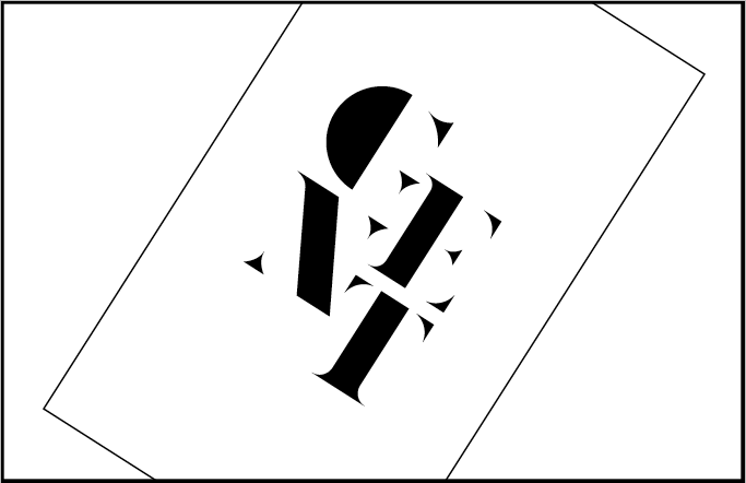
The feedback i received was as expected, unfortunately i didn't have a great deal for the crit so it would have been difficult asses my work so far, the main problem i had was my Gent No. 5 logo not being legible enough, some read it as CENT others read the 'N' as and X instead.

This is the original logo, i can see the problems much more now since they have been mentioned, i rectified these as best i felt they could be, i added fine lines connecting the serifs to the the other parts of the letter.


I'm happy with the bottom logo the other seems to be missing something still, i will continue to develop this logo but don't think i'll be spending much more time on it as i need to focus my other briefs.
Monday, 5 November 2012
Final artwork.
After a lot of discussion me and Dom decided on the artwork to use over our range, we thought using the 3D loco structure he made would be the most appropriate, mainly due to it's ability to be altered continuously whilst maintaining a similar aesthetic, it can be reproduced various different ways whilst staying recognisable as artwork.
Final artwork
Final artwork
Digital Serif 2.
Continuing to develop my serif logo, starting to take off a lot faster now and the letter forms are fitting together much more comfortably, i have also began experimenting with different designs digitally, some more geometric than others.


This first logo again feels quite contemporary which is half of what I'm going for, the traditional side to the logo is much more important for the aesthetic as it will represent a male barbers, still i like the design and feel with work it could well but i don't want to waste time developing a logo that isn't appropriate.


Original serif, This is the original logo i designed on paper, I'm getting there in terms of development i am fairly happy with this one, it has the traditional aesthetic i have been looking for within my designs, it still needs a lot of work and it isn't as legible as i would like it to be, i will continue developing this logo.

Really liked the idea of the letters connecting through serifs, unfortunately it isn't very legible and the aesthetic isn't great either.
Stock choice.
I literally feel spoilt for choice when it comes to stock now, I have on one hand the simple mission report style stock, being the beige textured stock from the Leeds student union, A lovely light blue with an interesting aesthetic or the Fedrigoni samples I received, they all look great. I do think the Fedrigoni samples stand out from the rest though, they give the project an extra dimension, with the feeling of being in space almost. As i said, I would like the reader to feel involved, at first I thought the best way to do this was with a mission report style publication, but this lovely Fedrigoni stock gives off a feeling of being in space along side the telescope which you can't top really.
stock choice
stock choice
Sunday, 4 November 2012
Binding.
Finally, I have found the binding clips I have been searching for, I have been looking all over Leeds and nobody seemed to have them, some shops had smaller ones that wouldn't have supported the publication. It wasn't until I tried the most obvious place in the world, Staples. I didn't really want to buy a pack of 50 as 3 would have done fine but I had to, they're great just as I expected and surprisingly supportive of the book, any way I'm really happy with the aesthetic and think they'll work brilliantly.
Bind
Bind
Fedrigoni.
At first I wanted to create a minimal aesthetic for this publication reflecting that of a mission report but after looking through Andy's stock samples the other week I was dieing to order some samples from Fedrigoni. Today they arrived and I couldn't have been happier, I found a stock called stardust, it couldn't have been more appropriate, there were 3 or 4 different colours all with a lovely silver speckled finish. These stocks could go hand in hand with the foil envelopes I want to order, I'm struggling to find the envelopes on an English website as of yet but I'm sure I'll get it sorted soon.
Any way here are the images of them, I would like to use black for the image publication to represent the telescope being in space and navy for the technical publication to represent the telescope being built on earth.
Fedrigoni
Any way here are the images of them, I would like to use black for the image publication to represent the telescope being in space and navy for the technical publication to represent the telescope being built on earth.
Fedrigoni
Saturday, 3 November 2012
Edwin.
I thought adding a quote from Edwin Hubble, the man the telescope is named after, just to finish the book off, the quote also says a lot about what the telescope is doing / done.


Friday, 2 November 2012
Digital Serif.
Getting excited about all these logo ideas i couldn't wait another day to get them onto the computer, starting with the serif idea, i found it quite difficult to create this design digitally as i had to create the letters GENT from scratch, unfortunately i couldn't find a typeface to base the logo on as there isn't much similar to it out there.
I still feel this logo needs a lot of work , for instance the serifs are too wide and obscure, the letters don't particularly fit together as if they were one typeface but for now i will focus on the sans logo and see where that takes me.


I still feel this logo needs a lot of work , for instance the serifs are too wide and obscure, the letters don't particularly fit together as if they were one typeface but for now i will focus on the sans logo and see where that takes me.


Thursday, 1 November 2012
Artwork cont.
Playing around with adding type to the artworks, this is Dom's job within the project but seen as though I have created my own artworks I wanted to see how they looked, some of them have turned out really nice, I want to continue developing them as our client said he liked some of my artwork as well as Dom's. I still need to use a lot more colour ways to get an idea of the potential. Also one of the artworks is extra glitchey giving me some really nice ideas for visuals unfortunately we won't be able to finish any for the deadline but as this is a live project we will develop some closer to the launch of the night.
Loco Artwork
Loco Artwork
Sans 2.
Again developing my third and final logo for this brief, this logo is beginning to look much better and a lot more contemporary compared to the others, I'm not sure if this one is completely appropriate as i wanted to create a traditional and modern aesthetic combined, whereas this one i very up to date and doesn't say traditional at all.
After a few experiments and looking for ways to include the 5 within the logo i developed this which i am very happy with, all that's left is to transfer it digitally.

After a few experiments and looking for ways to include the 5 within the logo i developed this which i am very happy with, all that's left is to transfer it digitally.

Wednesday, 31 October 2012
Serif 2.
Having furthered another idea for the Gent logo i decided my script design for the G wasn't appropriate, it seemed to feminine, i need the design to be bold and geometric as apposed to a single flowing line.
At first this idea didn't look great on the computer but i forgot how much time needed to be spent on vector based imagery, after a lot of re working i am fairly happy with the designs although they do need more time spent on them. I will still continue to develop my other ideas to get the best result but so far this idea is the strongest to me.


Furthering the serif idea i wanted to see if i create a logo where the letter forms flow through creating parts of other letters, it doesn't look great at the minute but seems like a cool idea and i will continue to develop it.


Subscribe to:
Comments (Atom)